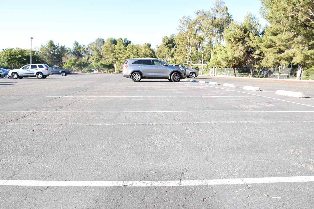
 Shutter Speed: 1/200, Aperture: f/8, ISO: 400 Line: This photo was taken in the student parking lot at Rancho. The photograph is of the lines of the parking spaces which is where the element of line takes place. This photo was successful, because it clearly demonstrates the element of line. 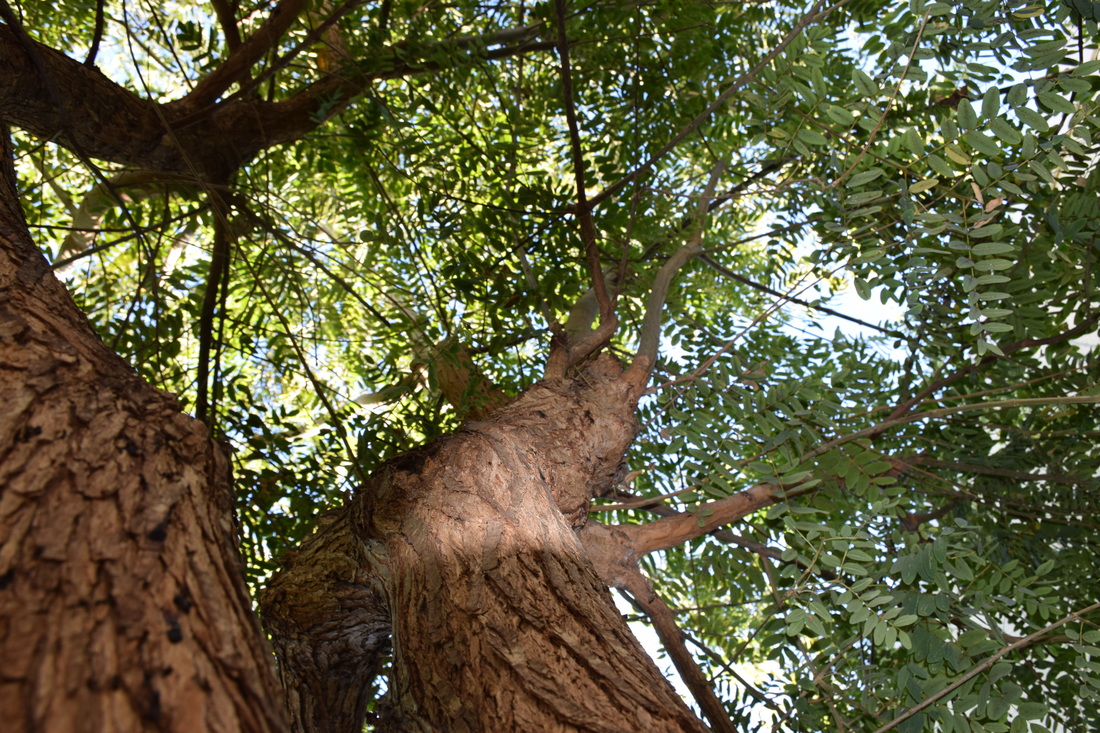 Shutter Speed: 1/60, Aperture: f/8, ISO: 400 Color: This photo was taken with the camera facing upward at the base of the tree. The element color is within the leaves of the tree, there are many different shades of green and your eyes are drawn towards the color. This photo was successful, because it gives a good example of color within the tree. 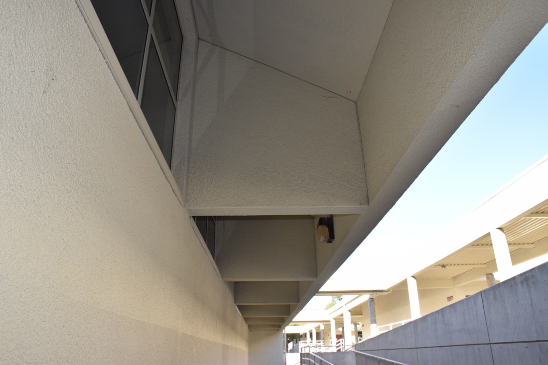 Shutter Speed: 1/200, Aperture: f/8, ISO: 400 Shape: This photo was take walking through the halls of Rancho. It is a photo of the different shapes that appear on the ceiling of this hallway. This photograph was successful, because it captures the image of shape in an unlikely place. 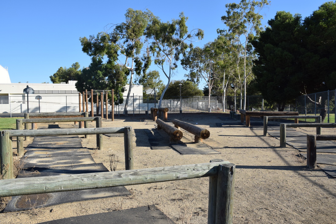 Shutter Speed: 1/800, Aperture: f/8, ISO: 400 Form: This photo was taken at the patch of all the different obstacles they have. The element of form shows up in this photo throughout the equipment on the patch because of all the different shapes, height, and width of each object. This photo was successful, because it gives a variety of examples of form. 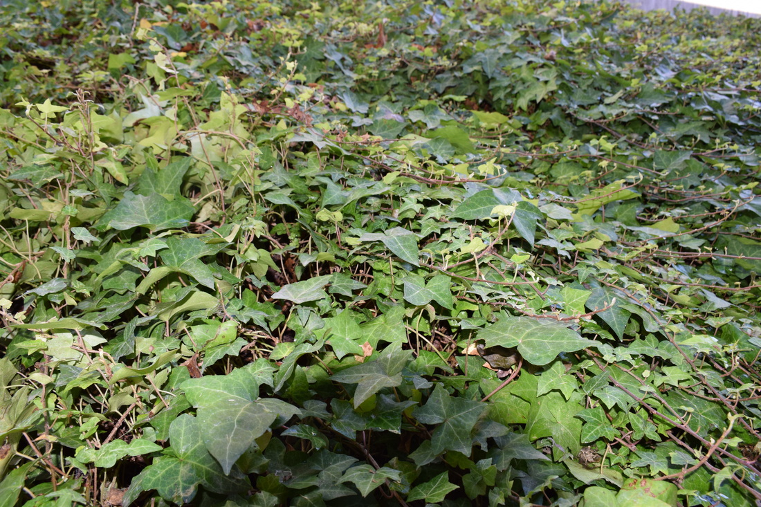 Shutter Speed: 1/60, Aperture: f/8, ISO: 400 Texture: This photo was taken of leaves at one of the planters. The element of texture appears throughout all the different ways the leaves are set up or placed. This photograph was successful, because of how much texture can be seen throughout it. 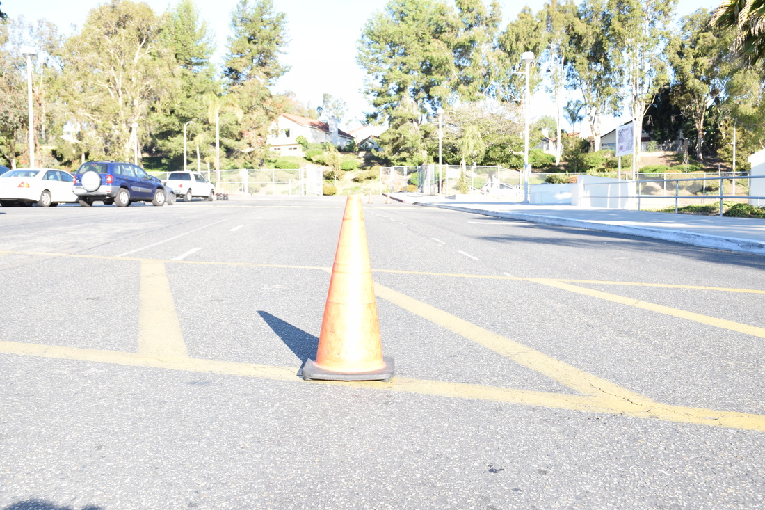 Shutter Speed: 1/200, Aperture: f/8, ISO: 400 Space: This photo was taken in the rancho student parking lot of a cone in the middle of the road. The element of space can be seen in this photo from the cone sitting in the middle of the picture all alone. This photograph was successful, because it gives an example of space in a place you wouldn't expect. 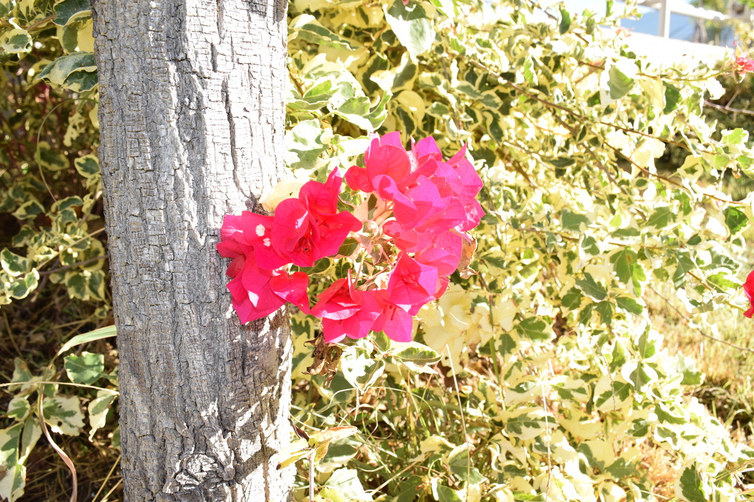 Shutter Speed: 1/200, Aperture: f/8, ISO: 400 Value:
This photograph was taken of a flower at one of the planters. The element of value can be seen in this photo from the colors of the flower and the leaves, because the over exposure of this photo affects the color. This photo was successful, because it gave a different example of value.
0 Comments
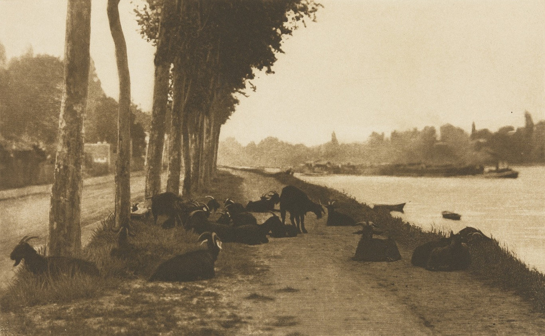 Alfred Stieglitz, On the Seine, near Paris 1894 Line: Line is a one dimensional photograph that varies in width, direction, and/or length. It can define edges of a form, can be horizontal, vertical, or diagonal, straight, or curved, thick or thin, and lines lead your eye around the composition. 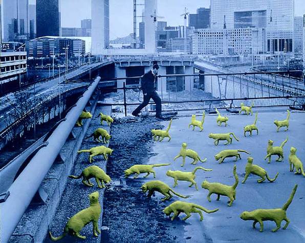 Sandy Skoglund, Cats in Paris, 1993 Color: Color consists of 3 main characteristics; hue(color), value(how dark or light), intensity(dark or bright) and the photo is either warm or cool. The colors can be either monochromatic, one color plus its tints(adding white) and shades (adding black), have complementary colors, colors opposite each other on the color wheel, or have analogous colors, colors next to each other on the color wheel. 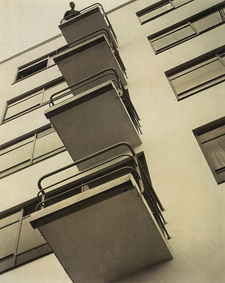 Laszlo Moholy-Nagy, Bauhaus Balconies (negative), 1926 Shape: Shape is 2 dimensional with a height and width. Organic shape is made by nature and not completely defined. Inorganic shape is manmade, such as triangles and rectangles. 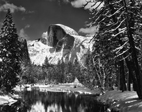 Ansel Adams, Half Dome, Merced River, Winter Form: Form is 3 dimensional and has height, width, and depth. You can emphasize form by use of highlights and shadows. 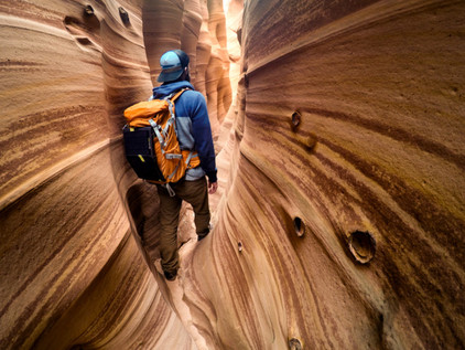 Travis Burke Texture: Texture is the surface quality of an object that we sense through touch; all objects have a physical texture. In a two dimensional work, texture gives a visual sense of how an object depicted would feel in real life if touched. 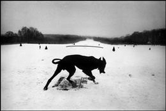 Josef Koudelka, Exiles Space: Real space is 3 dimensional; space in a work of art refers to a feeling of depth or 3 dimensions. Space can also refer to an artist’s use of the area around the picture plane. Positive space is the space occupied by the primary object and negative space is the space around the primary object  Ben Von Wong, Deliverance Value: Value is the lightness or darkness of a surface. It is frequently used when talking about shading, but also important in the study of color. 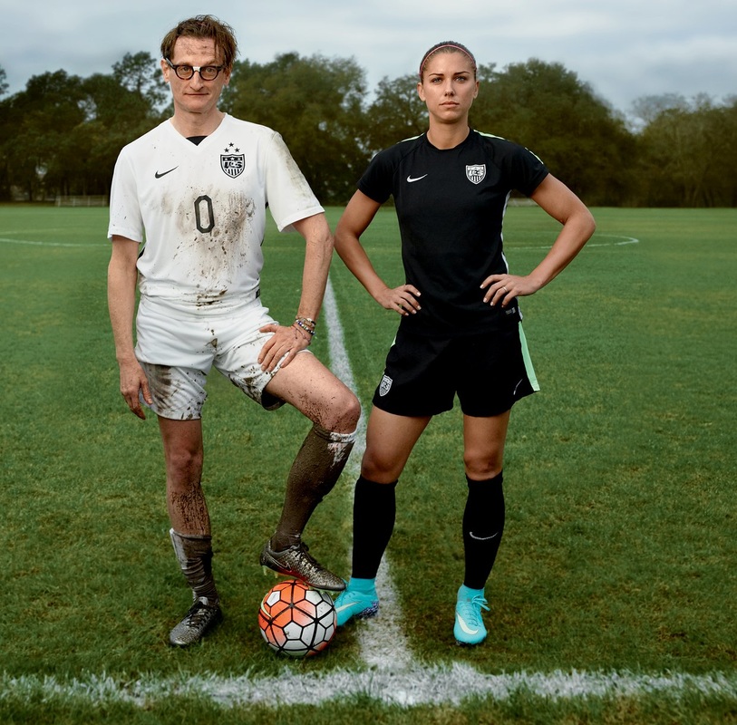 Annie Leibovitz, U.S. Soccer Balance: Balance is how an artist uses opposing forces in a composition that results in visual stability. Most successful compositions achieve balance in one of 2 ways; symmetrically(same on both sides) or asymmetrical. 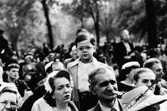 Diane Arbus, Boy Above a Crowd, NYC, 1957 Proportion: Proportion relates to the relative size and scale of the various elements in a design, specifically the relationship between the objects. 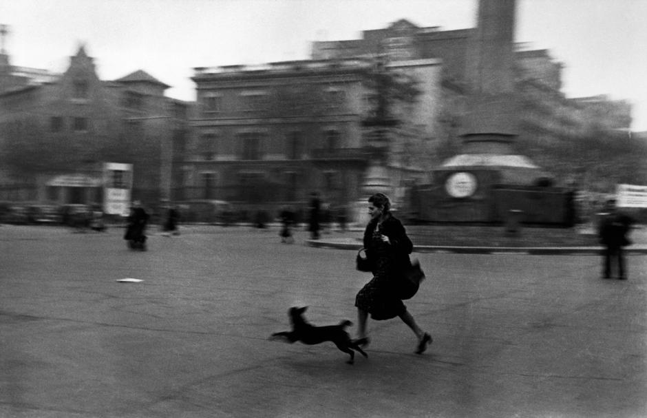 Robert Capa, BARCELONA, 1936, Spain Rhythm: Rhythm indicates movement by the repetition of elements and can make an artwork seem active. 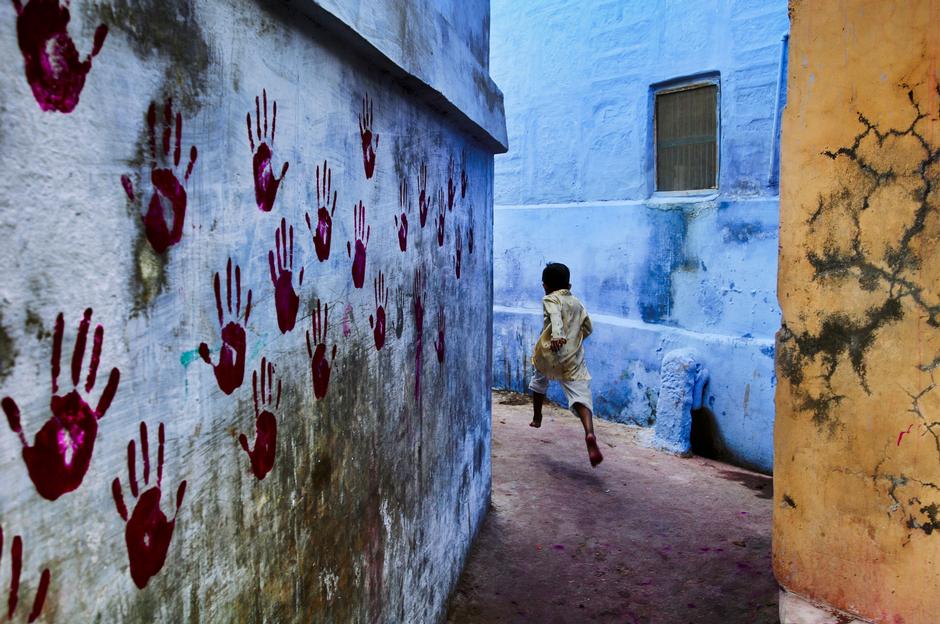 Steve McCurry, INDIA, Jodhpur, 2007 Emphasis: Emphasis makes one part of the artwork dominant over the other parts. It attracts the viewer’s eyes to a place of special importance in an artwork. 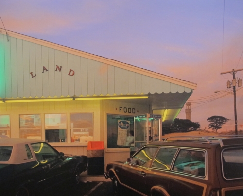 Joel Meyerowitz, Land, Provincetown, 1976 Harmony: Harmony is a pleasing quality achieved by different elements of a composition interacting to form a whole, it is often accomplished through repetition of the same or similar characteristics. 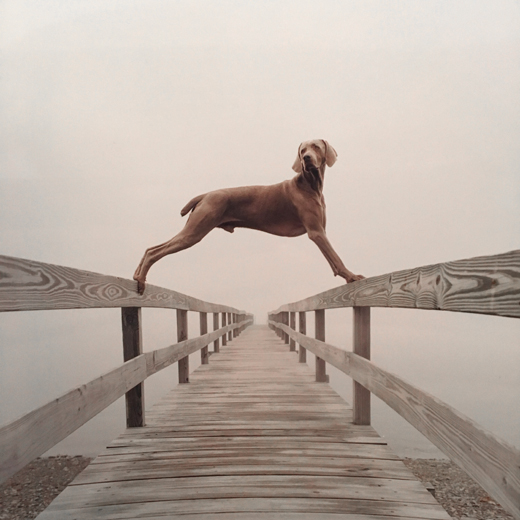 William Wegman, Covered Bridge, 2002 Variety: Variety is differences achieved by opposing, contrasting, changing, elaborating, or diversifying elements in a composition to add individualism and interest. 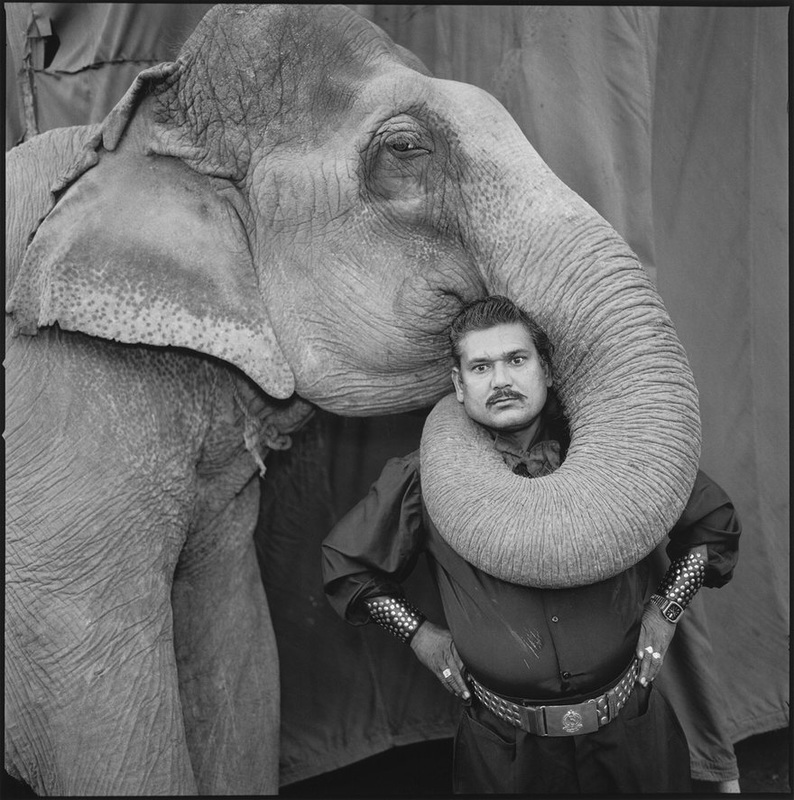 Mary Ellen Mark, Great Golden Circus, Ahmedabad, India, 1990 Unity:
Unity is the result of bringing elements of art into the appropriate ratio between harmony and variety to achieve a sense of oneness, it is the sense that everything works together and looks like it fits. 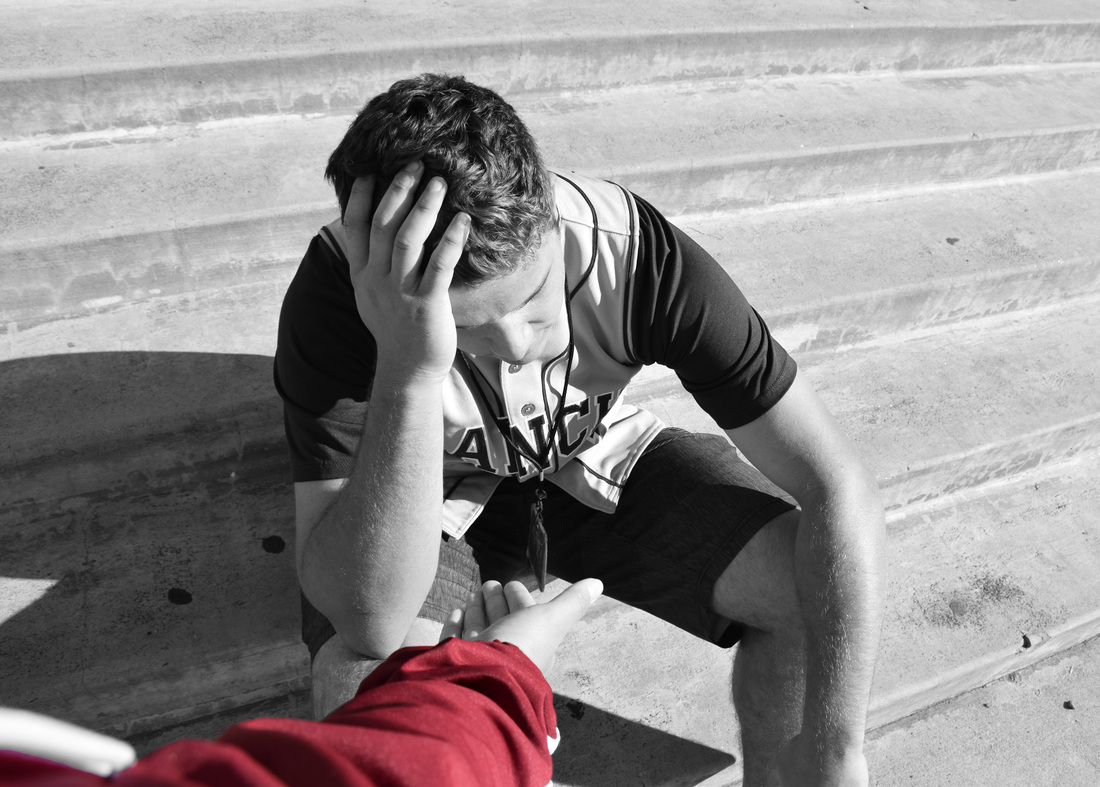 The photo I have taken shows a boy sitting on the stairs seeming upset; there is a hand reaching out to help him up. This photograph tells a story everyone is able to relate to throughout their life. At some point in your life you have felt down, sad, overwhelmed, and like your whole world may be crumbling down and all you can do is sit there and watch. That is what this boy is going through. You are left wondering what he may be dealing with. Then you have the “helpful hand” who is there to help the boy with whatever he may be dealing with.
To respect yourself sometimes means to help other people, therefore you are making yourself a better person. You may believe that having self respect has to do with being kind to yourself, which in most cases it does, but I also see it as a chance to make yourself feel good by making a difference in someone’s life. I chose to make the arm the only colored part of this photo because it ties into what I am trying to say. This red arm is sort of like the “helpful hand” in this boy’s life, which will respect themselves by helping someone else. 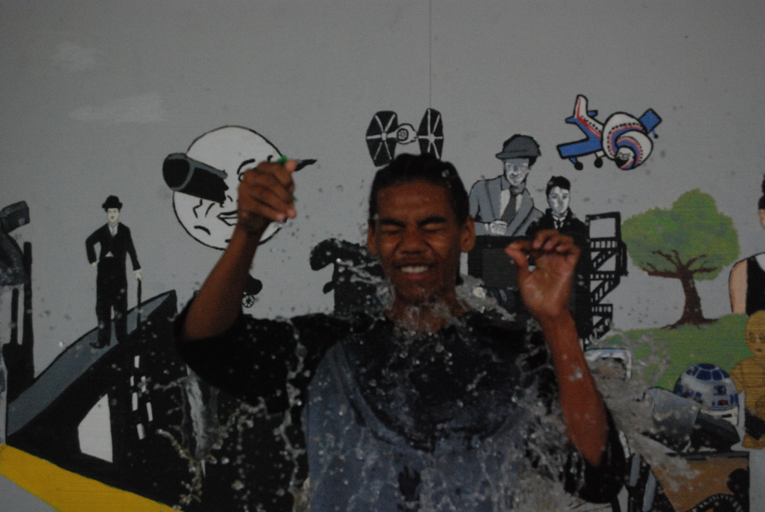 ISO: 1600, Shutter Speed: 1/750, Aperture: f/6.7 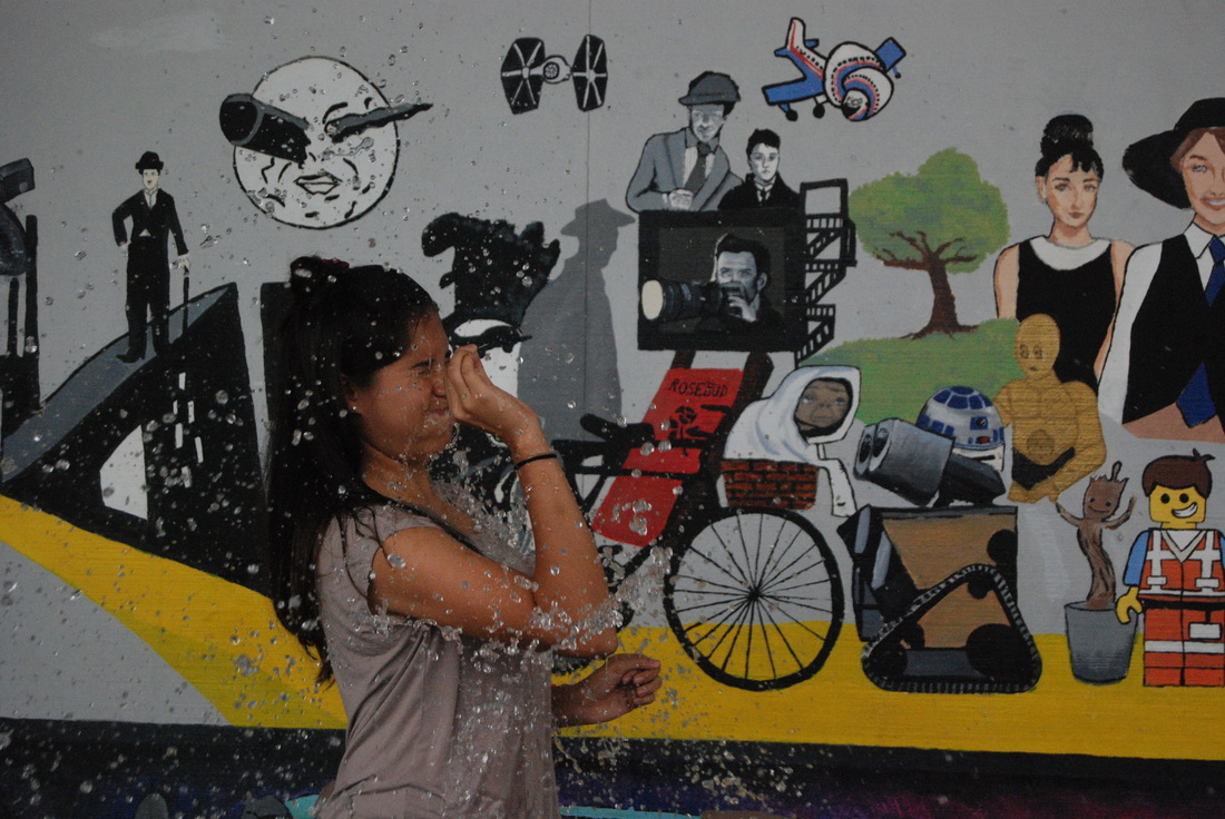 ISO: 1600, Shutter Speed: 1/750, Aperture: f/5.6 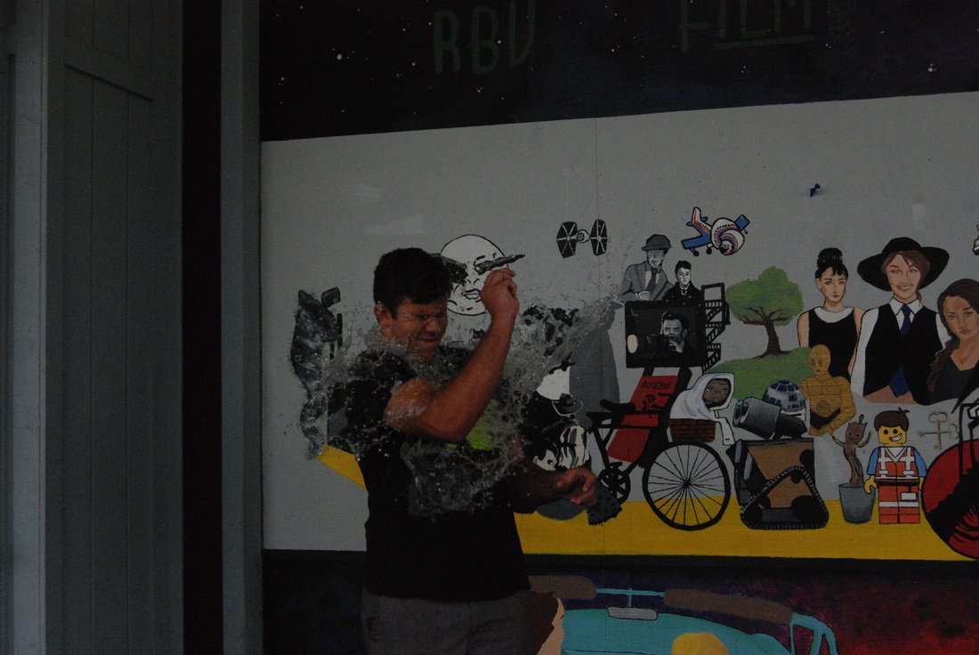 ISO: 1600, Shutter Speed: 1/750, Aperture: f/6.7  ISO: 1600, Shutter Speed: 1/750, Aperture: f/11  ISO: 1600, Shutter Speed: 1/750, Aperture: f/5.6  ISO: 1600, Shutter Speed: 1/750, Aperture: f/5.6  ISO: 1600, Shutter Speed: 1/750, f/6.7  ISO: 1600, Shutter Speed: 1/750, Aperture: f/6.7 I took these photographs using a shutter speed of 1/750, an ISO of 1600, and the aperture varied throughout the photos. One struggle we had while taking these photos was that using a shutter speed of 1/1000 made the photos come out too dark so we changed the shutter speed to 1/750 whited helped fix the issue. Three things I learned about fast shutter speed is that your photos may come out too light or too dark which can be fixed by changing the shutter speed, you need to make sure you are focused while taking the photo or else it can come out extremely blurry, and having a fast shutter speed can help you capture moments very quickly. Other things you could use fast shutter speed for could be a person running or a car driving, anything where the subject of the photo will be in motion.
 Shutter Speed: 8.0, Aperture: f/5.6, ISO: 100  Shutter Speed: 8.0, Aperture: f/5.6, ISO: 100  Shutter Speed: 8.0, Aperture: f/5.6, ISO: 100  Shutter Speed: 8.0, Aperture: f/5.6, ISO: 100  Shutter Speed: 8.0, Aperture: f/5.6, ISO: 100 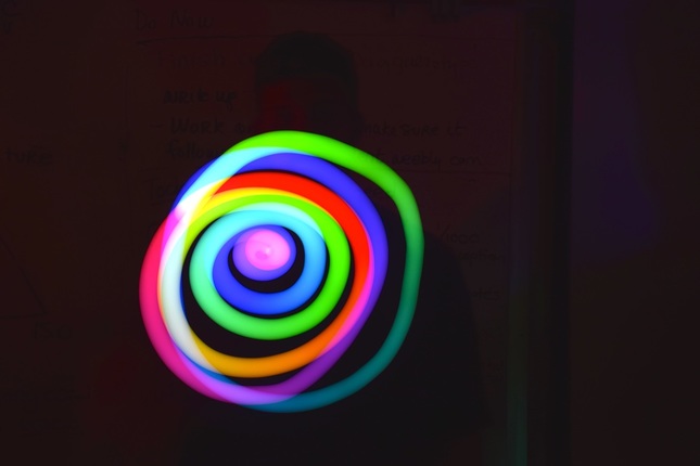 Shutter Speed: 8.0, Aperture: f/5.6, ISO: 100 To take these light painting photos we darkened the room and set up tripods for our cameras. One partner will be taking the photos while the other moves around glow sticks or an app on your phone to make different designs for the photos. My partner and I used glow sticks and an app called MyLightPaint to achieve the designs in the photos above. One struggle I had with light painting was keeping the photo in focus; I found that a lot of photos were coming out blurry. 3 thing that I learned from light painting are that in order for the designs to show up you need to have a longer stutter speed, focusing on your partner before you take the photo will help make the photo come out less blurry, and make sure your tripod is steady while taking each photo. An idea you could do with light painting would be spelling out words; we tried spelling out our names but it was a lot harder than it seemed.
|
AuthorMy name is Madelin Burdick and I am and currently in my senior year of high school. Some things I really enjoy are cheerleading, going to the beach, and adventuring around with my friends. Archives
May 2017
Categories |
 RSS Feed
