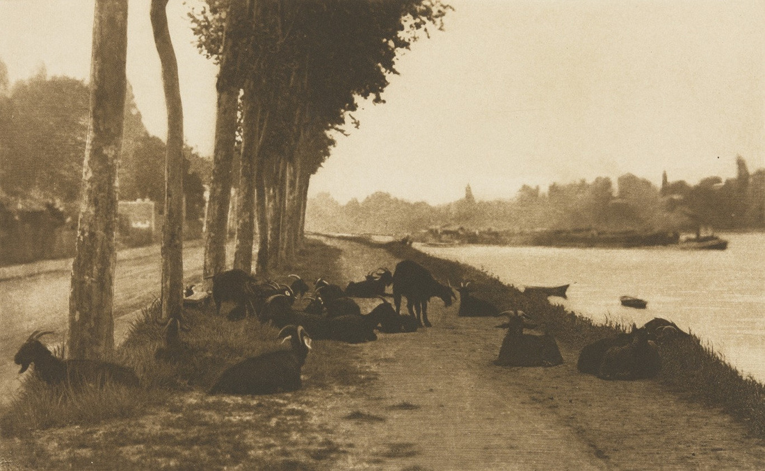
 Alfred Stieglitz, On the Seine, near Paris 1894 Line: Line is a one dimensional photograph that varies in width, direction, and/or length. It can define edges of a form, can be horizontal, vertical, or diagonal, straight, or curved, thick or thin, and lines lead your eye around the composition. 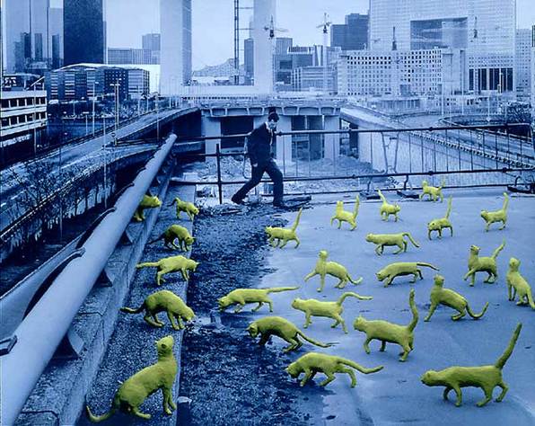 Sandy Skoglund, Cats in Paris, 1993 Color: Color consists of 3 main characteristics; hue(color), value(how dark or light), intensity(dark or bright) and the photo is either warm or cool. The colors can be either monochromatic, one color plus its tints(adding white) and shades (adding black), have complementary colors, colors opposite each other on the color wheel, or have analogous colors, colors next to each other on the color wheel. 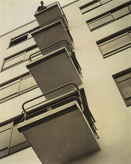 Laszlo Moholy-Nagy, Bauhaus Balconies (negative), 1926 Shape: Shape is 2 dimensional with a height and width. Organic shape is made by nature and not completely defined. Inorganic shape is manmade, such as triangles and rectangles. 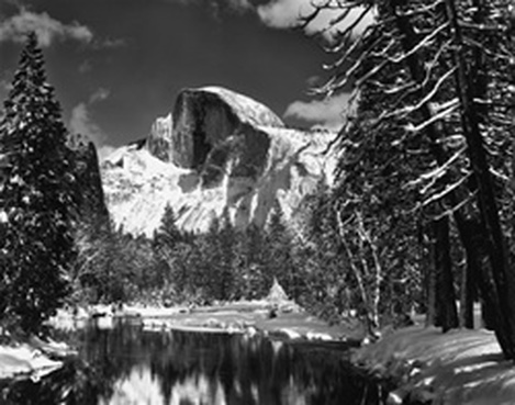 Ansel Adams, Half Dome, Merced River, Winter Form: Form is 3 dimensional and has height, width, and depth. You can emphasize form by use of highlights and shadows. 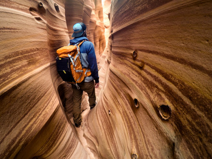 Travis Burke Texture: Texture is the surface quality of an object that we sense through touch; all objects have a physical texture. In a two dimensional work, texture gives a visual sense of how an object depicted would feel in real life if touched. 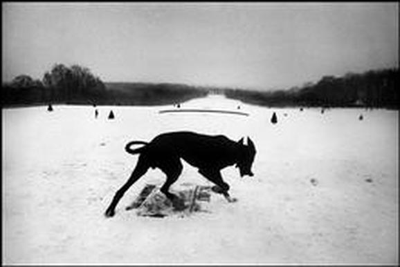 Josef Koudelka, Exiles Space: Real space is 3 dimensional; space in a work of art refers to a feeling of depth or 3 dimensions. Space can also refer to an artist’s use of the area around the picture plane. Positive space is the space occupied by the primary object and negative space is the space around the primary object 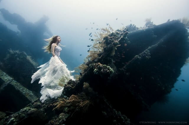 Ben Von Wong, Deliverance Value: Value is the lightness or darkness of a surface. It is frequently used when talking about shading, but also important in the study of color.  Annie Leibovitz, U.S. Soccer Balance: Balance is how an artist uses opposing forces in a composition that results in visual stability. Most successful compositions achieve balance in one of 2 ways; symmetrically(same on both sides) or asymmetrical. 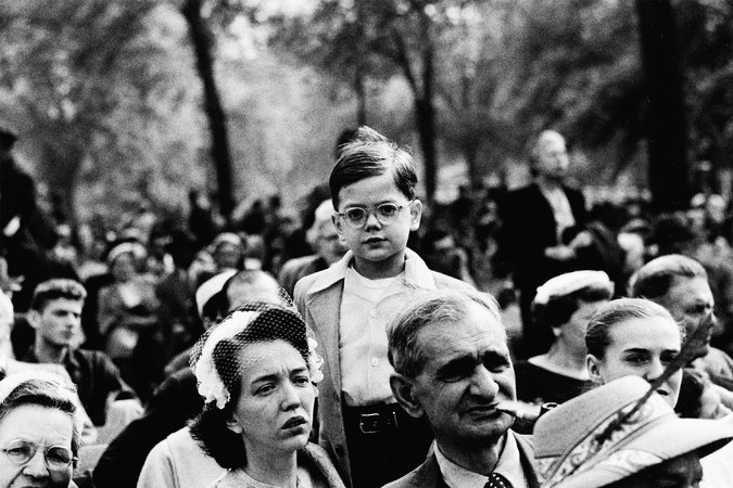 Diane Arbus, Boy Above a Crowd, NYC, 1957 Proportion: Proportion relates to the relative size and scale of the various elements in a design, specifically the relationship between the objects. 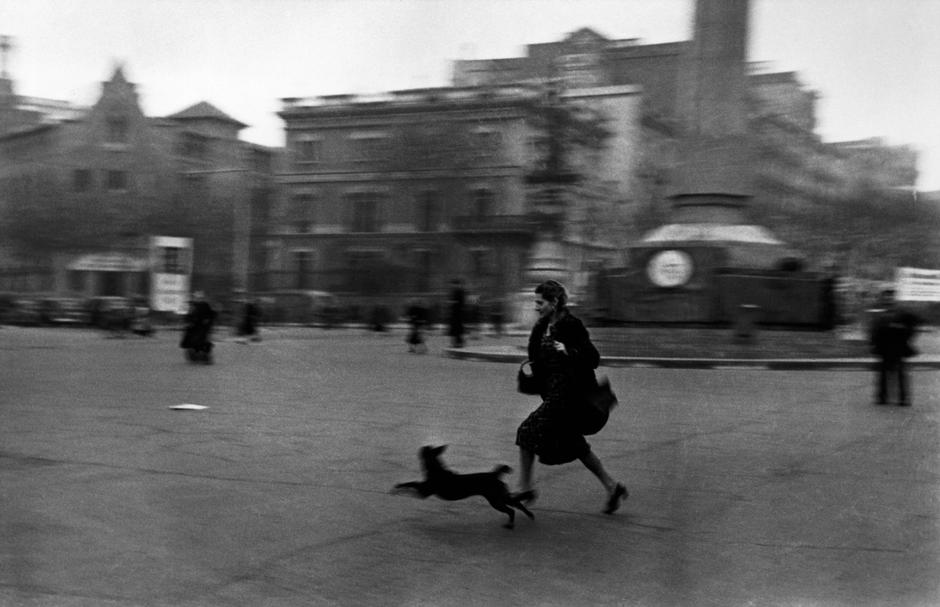 Robert Capa, BARCELONA, 1936, Spain Rhythm: Rhythm indicates movement by the repetition of elements and can make an artwork seem active. 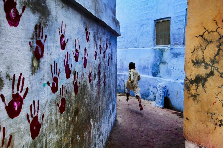 Steve McCurry, INDIA, Jodhpur, 2007 Emphasis: Emphasis makes one part of the artwork dominant over the other parts. It attracts the viewer’s eyes to a place of special importance in an artwork. 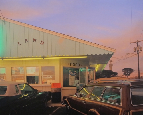 Joel Meyerowitz, Land, Provincetown, 1976 Harmony: Harmony is a pleasing quality achieved by different elements of a composition interacting to form a whole, it is often accomplished through repetition of the same or similar characteristics. 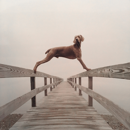 William Wegman, Covered Bridge, 2002 Variety: Variety is differences achieved by opposing, contrasting, changing, elaborating, or diversifying elements in a composition to add individualism and interest. 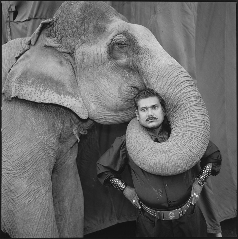 Mary Ellen Mark, Great Golden Circus, Ahmedabad, India, 1990 Unity:
Unity is the result of bringing elements of art into the appropriate ratio between harmony and variety to achieve a sense of oneness, it is the sense that everything works together and looks like it fits.
0 Comments
Leave a Reply. |
AuthorMy name is Madelin Burdick and I am and currently in my senior year of high school. Some things I really enjoy are cheerleading, going to the beach, and adventuring around with my friends. Archives
May 2017
Categories |
 RSS Feed
